
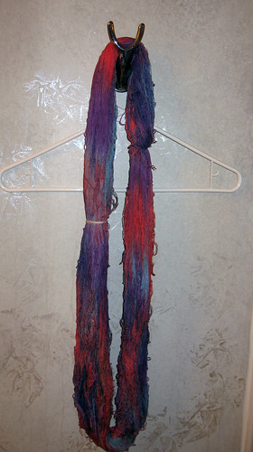
It's been hanging in my bathroom ever since. By the way, the silver sponged on gray walls? I did not do that, I just haven't gotten around to repainting. The yarn colors are two purples, a blue of some shade or other, and something that came out much more orange than I had intended. I was really hating the colors (which are more intense in the above picture than in reality) until a co-worker sent me a web page of Hundertwasser posters. Suddenly purple, blue and orange makes sense.
However, all is not well. I didn't let the yarn sit long enough before rinsing the dye out, so the color isn't as saturated as I would like, and the orange doesn't play well with others so the colors mixed in a less than attractive way.
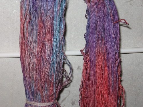
I think a way to fix the problem of colors not playing well together is to make sure they share at least one color component. In this case, the purples and blue share navy blue, and the purples have fuchsia and a splash of black. The orange, on the other hand, has carmine red and golden yellow. I might have been happier had I used fuchsia instead of red. Oh well. Dye and learn.
Ugh. That was very bad. Sorry.


1 comment:
Never judge a skein until you've sampled with it. Is the yarn for knitting or weaving? If for weaving, perhaps you can cross it with a shade that will pull it together?
Thanks for the link to the poster page!
Post a Comment